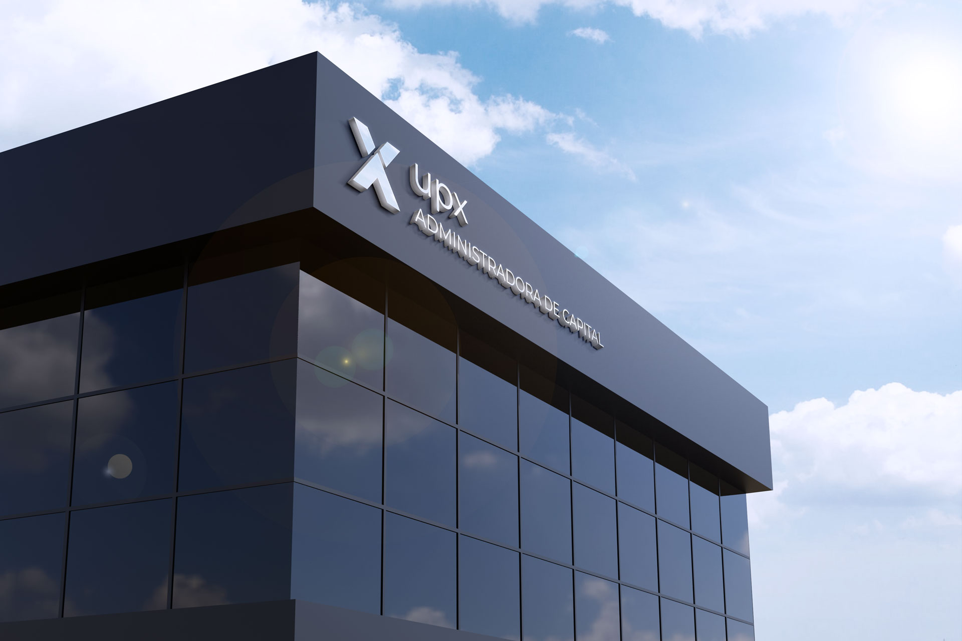
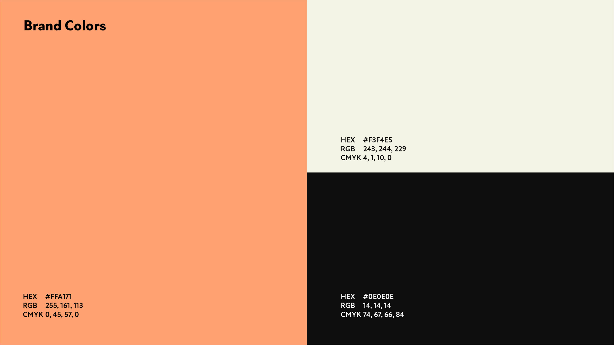
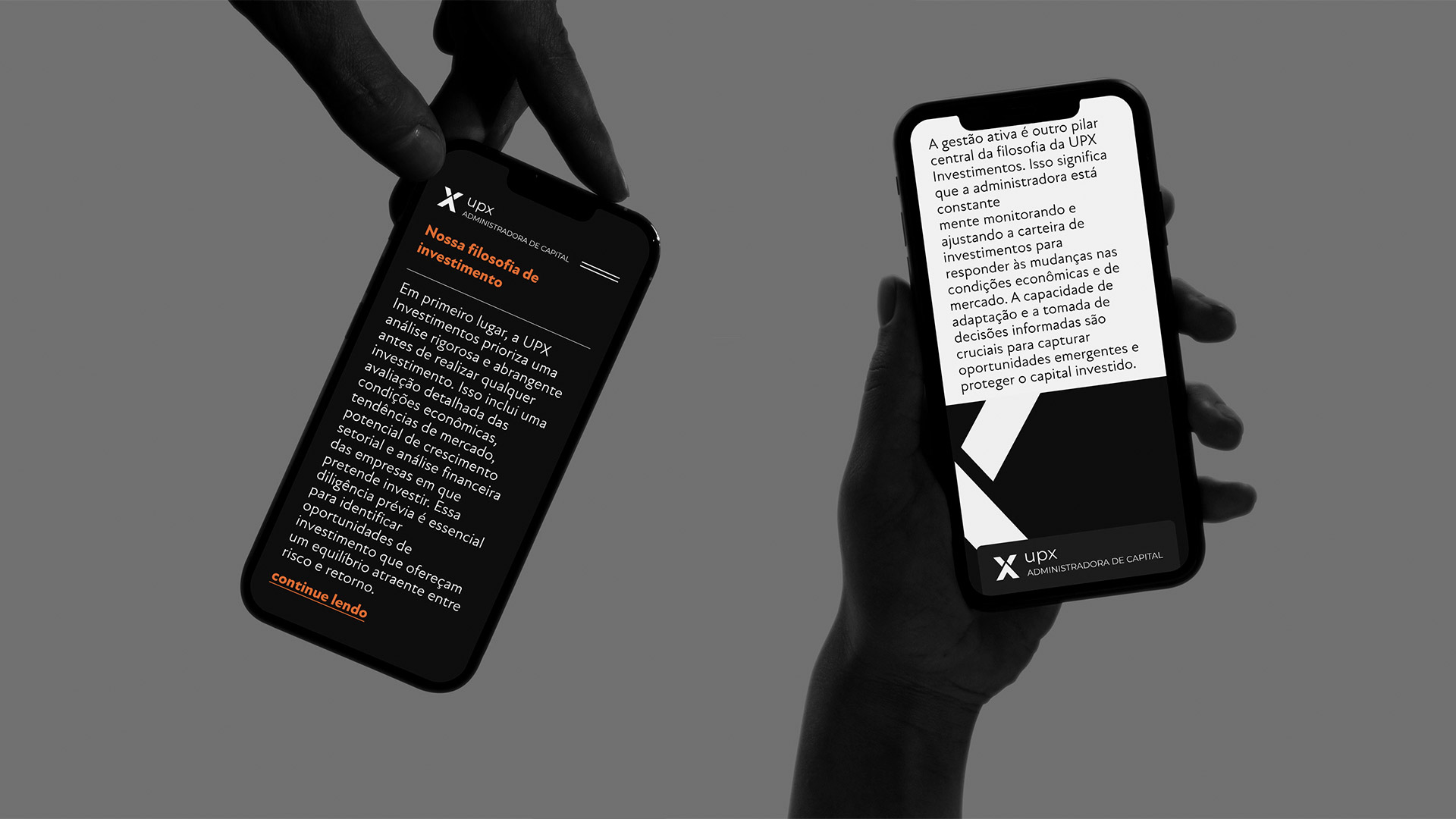
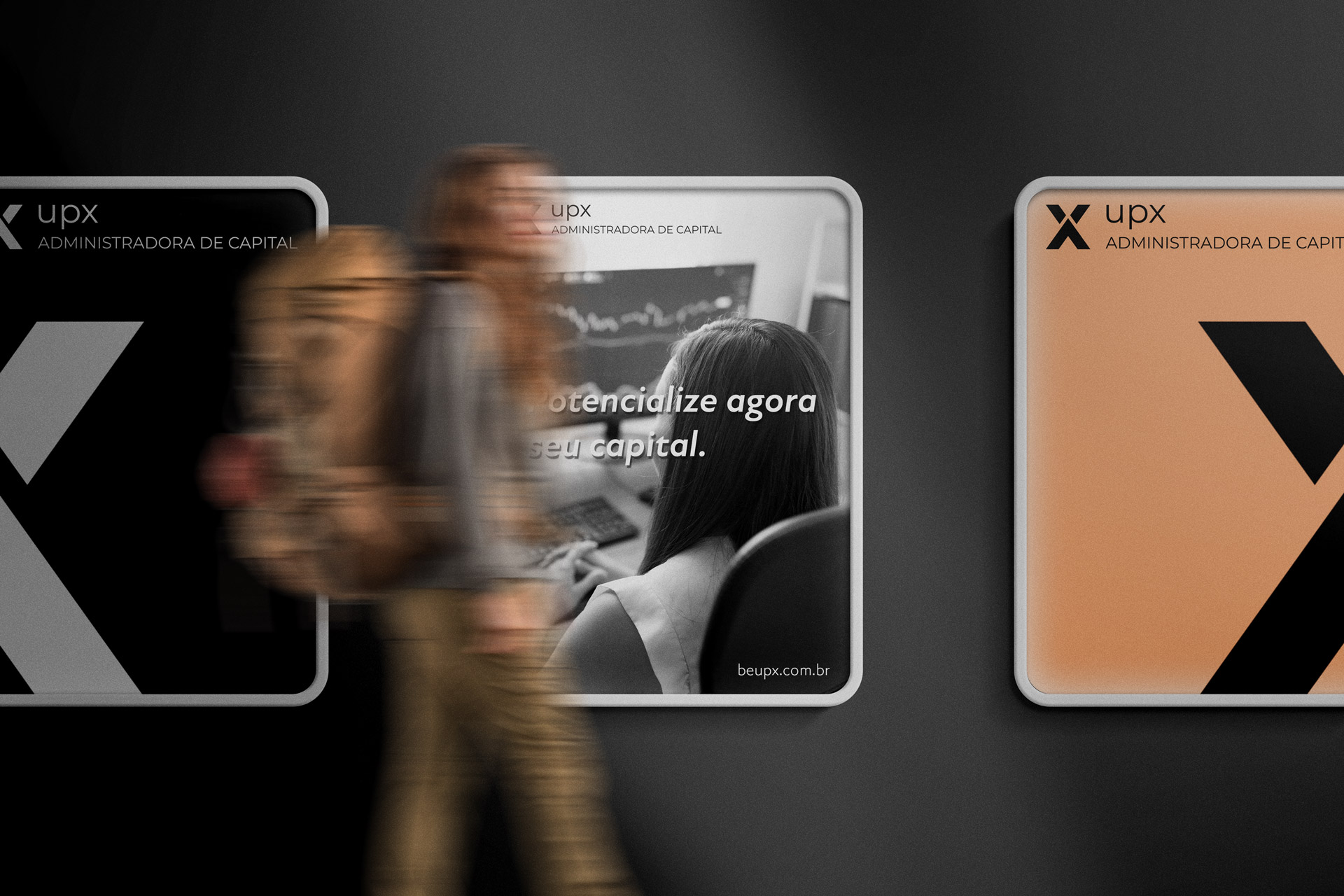
The UPX brand was created to establish a strong and trustworthy connection with clients, reflecting its expertise and purpose. The logo incorporates elements of financial management, such as symbols, shapes, and colours that represent growth, stability, and prosperity. It conveys professionalism, reliability, and a focus on results, appealing to those who value strategic investment and financial excellence.







STRENGTH, GROWTH, AND PROSPERITY
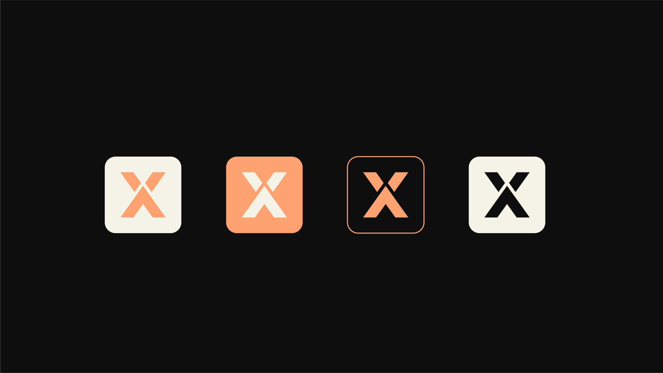
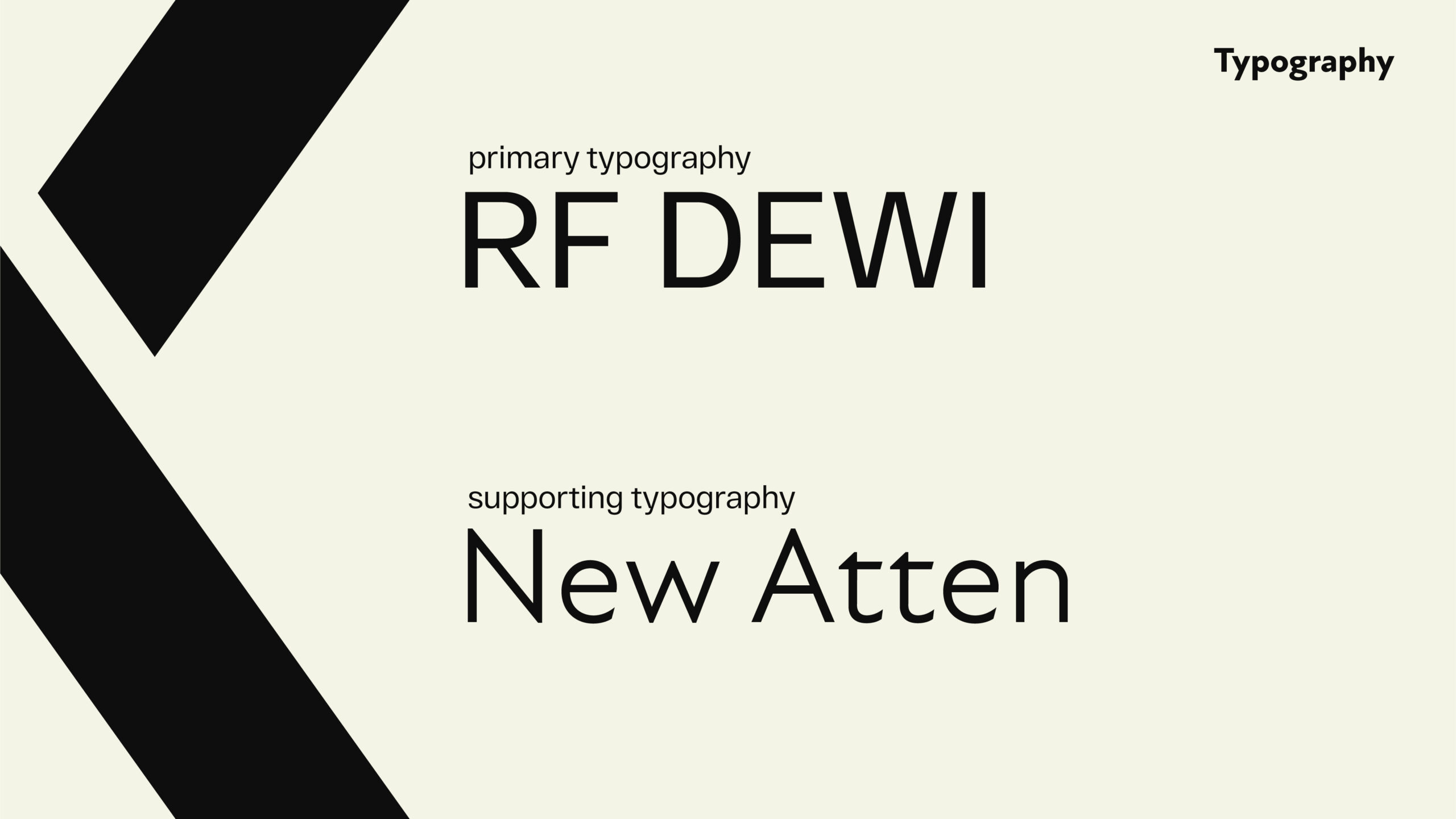
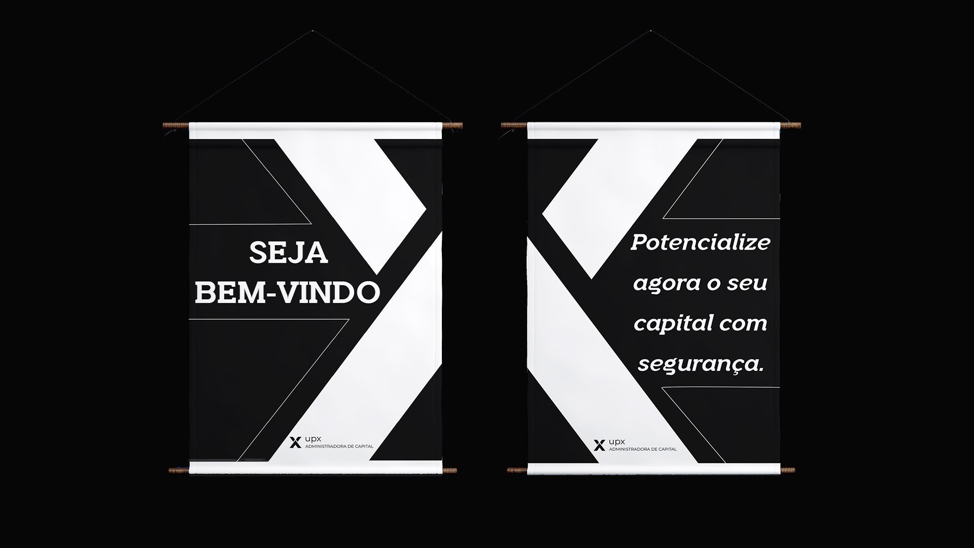
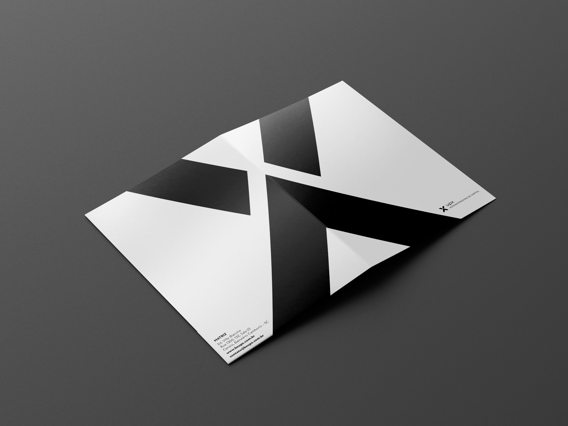
The UPX logo design combines modern, geometric typography that conveys strength and stability, reflecting the company’s commitment to growth and financial excellence. The "X" in the logo serves as a central visual element, symbolising precision, connection, and the intersection of opportunities. Its bold, angular form represents the crossroads of innovation and strategy, reinforcing UPX’s mission to navigate the complexities of financial markets with confidence and clarity.
This detail adds a dynamic and forward-thinking character to the logo, making it instantly recognisable and impactful. The design ensures a strong visual presence while conveying trust and professionalism, perfectly aligning with the aspirations of clients who seek sustainable financial success.