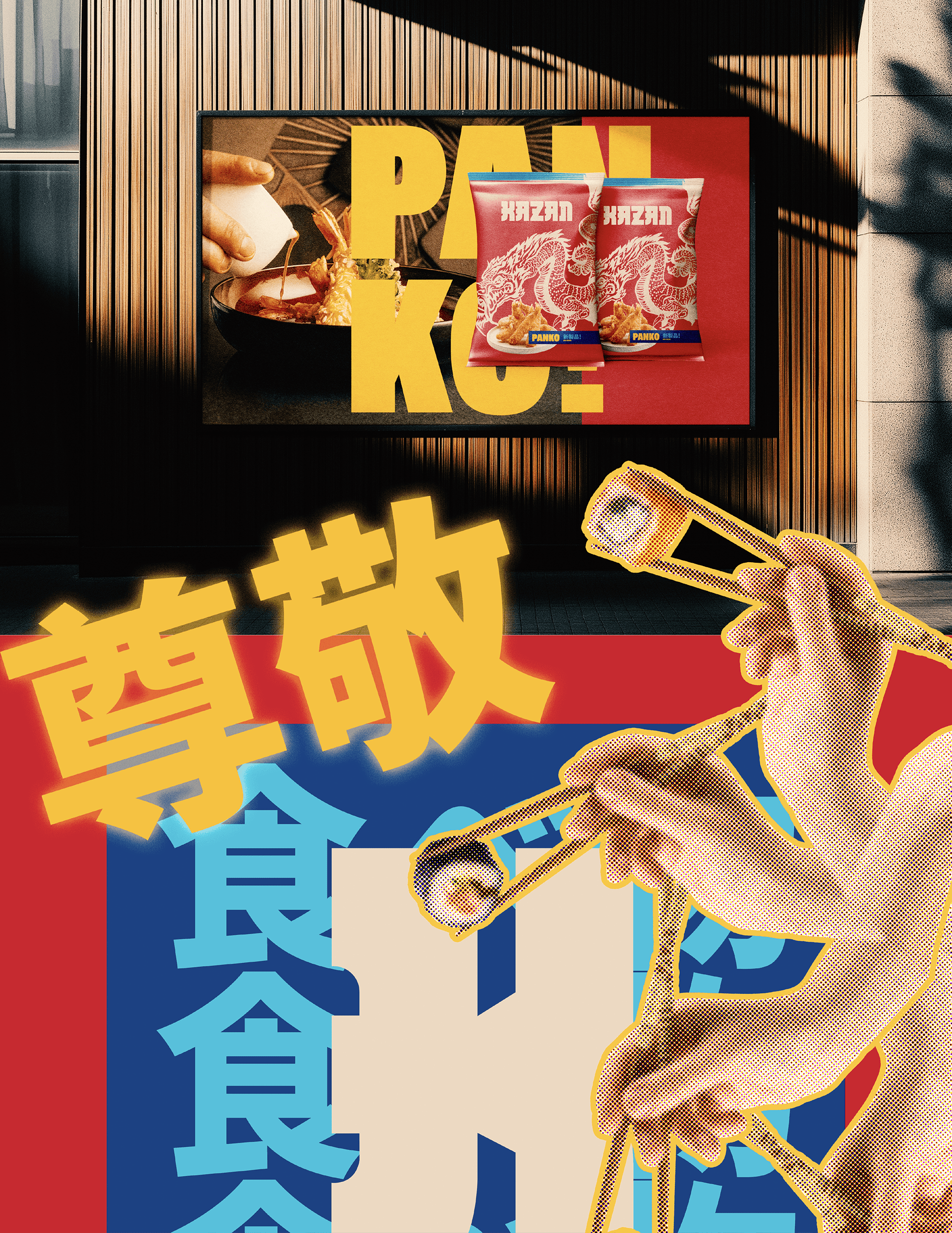
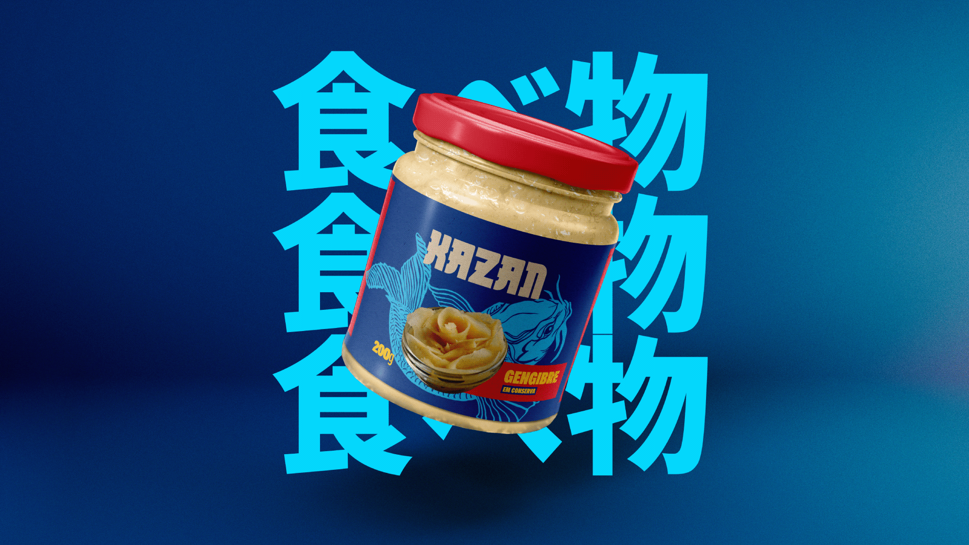
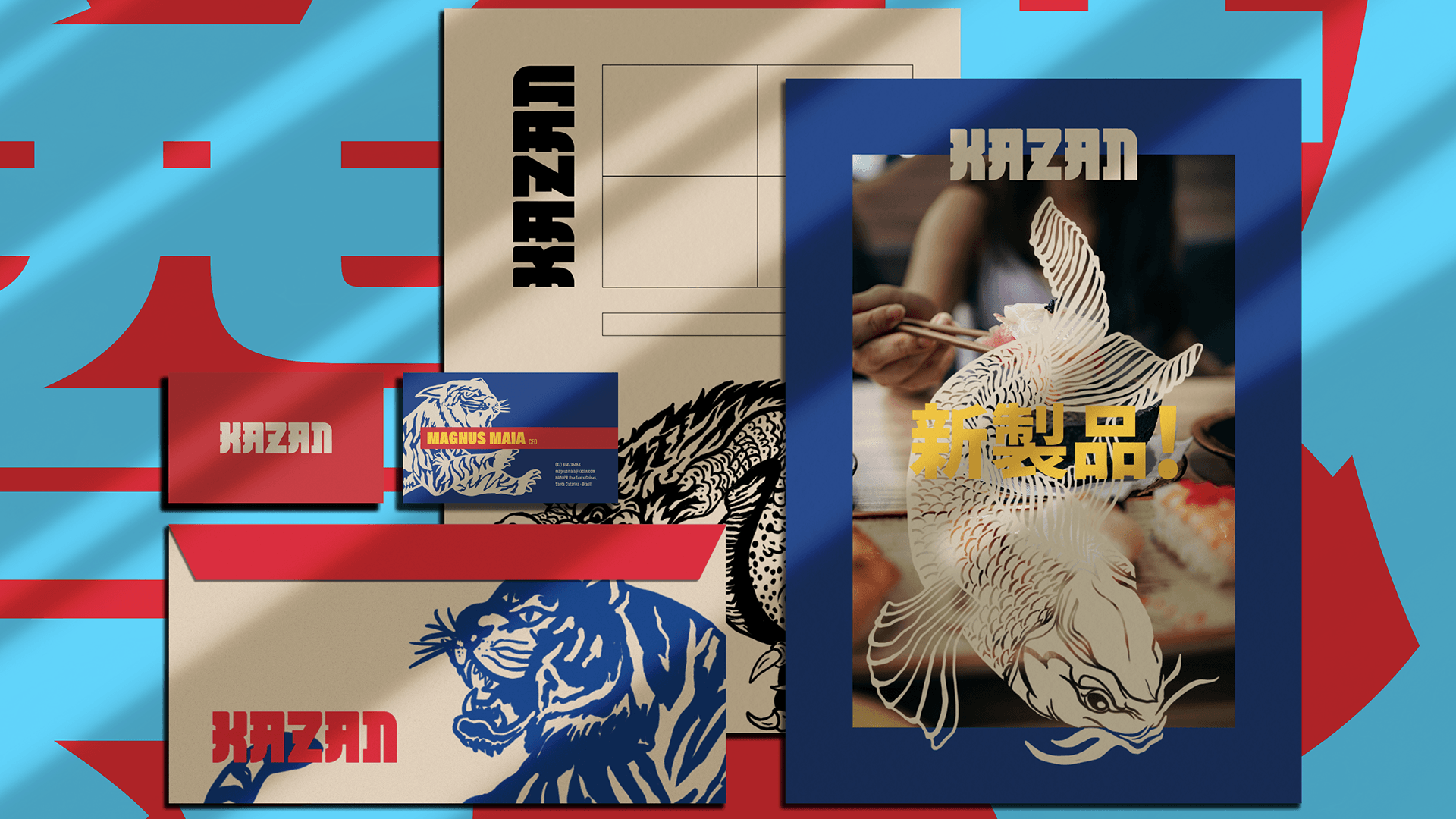
The Kazan brand was created to establish an authentic connection with consumers, reflecting its origins and essence. The logo incorporates elements of Japanese culture, such as shapes, colours, and symbols of its cuisine, conveying authenticity, quality, and respect for tradition, appealing to those who value the sushi experience.


STRENGTH, TRADITION, AND IMPACT
The KAZAN logo design combines robust, geometric typography that conveys strength and solidity, reflecting the values of tradition and quality tied to Japanese products. The angular, bold shapes of the font reference the Japanese alphabet, particularly through its stylized serifs, reminiscent of kanji calligraphic strokes. This detail adds an authentic and culturally significant touch to the logo, strengthening its connection to Japanese roots while ensuring clear and impactful readability for the Brazilian audience.